100 Questions Designed to Boost Your Visual/Arts Intelligence Quotient

11


Q. When was the last time you stepped out of your visual comfort zone?

A. There are many ways to jump-start your visual life and imagination. These can range from simply looking more closely at an object you look at every day to actively seeking out new visual challenges and stimulation. You may also choose to spend more time thinking through your thoughts, associations and references as you view new and existing images of all kinds.

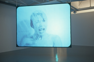
The video still above is from the work of the Scottish artist Douglas Gordon; you may recognize the famous face of Captain Kirk from Star Trek. In his work, Star Trek: Predictable Incident in Unfamiliar Surroundings, Gordon has selected Kirk’s amorous encounters with fellow crew members (and random aliens) as the subject of his short videos.  He shows us (or reshows us) these encounters, looped and in slow motion and in doing so he creates entirely new images. When viewed at a slower pace, these familiar scenes become powerfully dreamlike, charged much more obviously with an aggressive kind of sexuality. This is just one example of the way simple visual shifts can radically alter our perception and experience (even of things we think we already know well). Gordon uses the same technique by reshowing us a slow motion (24 hour version) of Psycho – again completely recasting the viewing experience for us and creating a transformed narrative.

dg_24_hour_psycho

See clips from Gordon’s videos here…

http://www.dailymotion.com/video/xl8n45_douglas-gordon-star-trek-predictable-incident-in-unfamiliar-surroundings-1995_creation

http://www.bing.com/videos/search?q=douglas+gordon&view=detail&mid=2FFD03397920FD83BAD42FFD03397920FD83BAD4&first=0

the-master-image

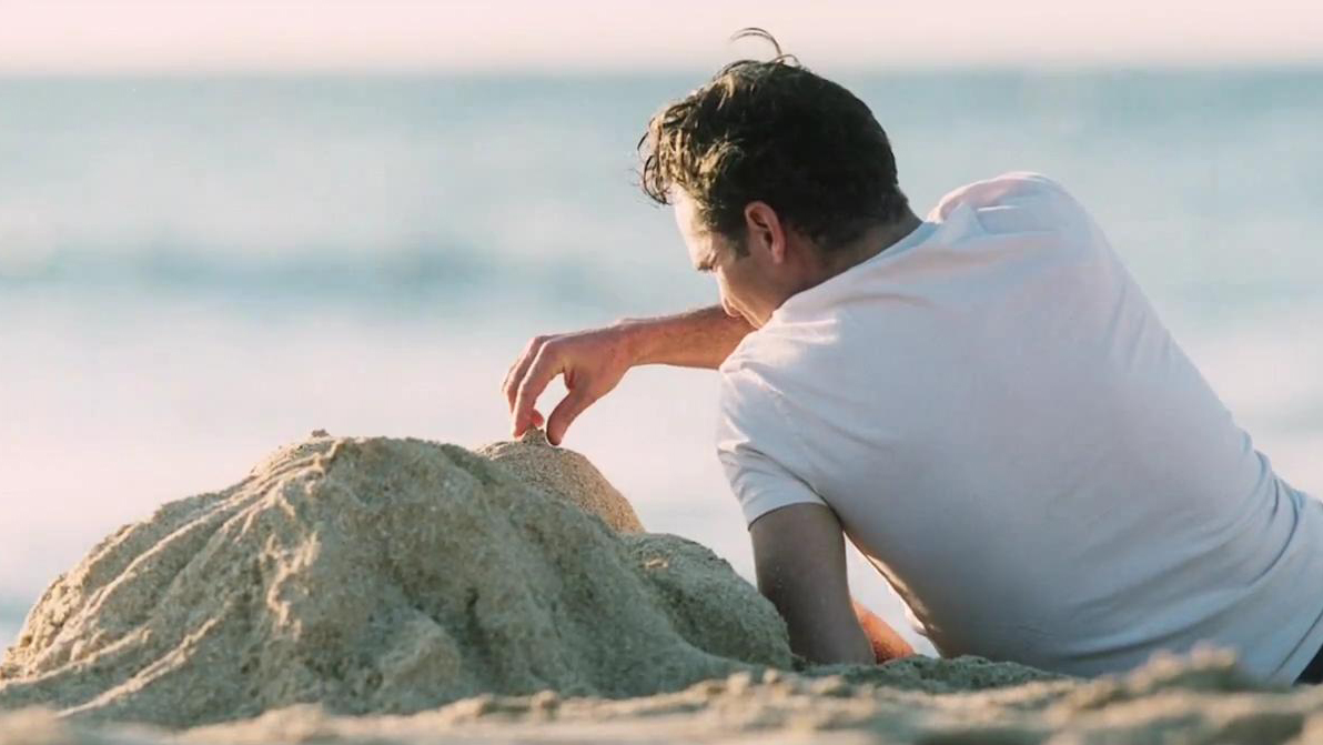
The image above is from Paul Thomas Anderson’s critically acclaimed film The Master, which is believed by many to be a cinematic masterpiece. The film is, however, complex and challenging and some sexually explicit scenes, despite their importance to character development, along with an unconventional approach to plot, made the average moviegoer very uncomfortable.

See if you can challenge yourself by seeking out a work of art that has created controversy and use the experience to better understand your expectations and emotional reactions.

You may also want to ask yourself, if art gives us what we already know, expect and are sure to enjoy, what is the value of art and what is to be gained from the experience of looking?

12

Q. The top two photographs are the work of the artist Loretta Lux and the screen shot below them is from an advertisement. What elements from Lux’s work do you see in the advertisement?

A. The hairstyle, position of the body, the low and distant horizon, and even the color palette is similar in the advertisement. Lux’s portraits allow us to access the very private and mysterious lives of children. In the advertisement, we peek over the shoulder of the caller as if we are being allowed in on a private and somewhat otherworldly conversation. So not only is the advertisement stylistically similar, the image narratives are alike as well. Although we are not always aware of it, advertisers often take from the highly original and fresh world of fine art.

13

Q. How do you think the direction of these cars is being used to support visual narrative?

A. This is a story telling device used frequently in moving images. Our intuitive understanding of the direction of these cars comes from the way we read: from left to right. We, therefore, understand that the green car (driven by Steve McQueen) is going away from something and the car below it (driven by Thelma and Louise) is going toward something. The image of Steve McQueen in the green car is taken from the film Bullitt which includes a highly complex car chase (one of the best on film). Initially McQueen is followed by some bad guys in another car but through very clever driving he shifts the scene and begins to chase the car that was following him. The direction of the cars helps us understand the complex action and changing dynamics. Although Thelma and Louise are driving off a cliff they are also going toward something – their metaphoric “freedom”.

Annie Leibovitz may have used this device in her photograph of Queen Elizabeth. In this late-life portrait, the Queen looks to the left which is a subtle way of indicating that she is looking into the past and not the future. She is, based on our intuitive understanding of direction, reviewing something, not looking toward something.

So then, why is the car in this commercial for Viagra going to the left instead of the right? Probably because this medication promises to take middle-aged men with ED back to a time when their sexual performance was at its peak.

14

Q. What color blue is this?

A. This color is commonly referred to as Tiffany Blue because it is the signature color of the jeweler Tiffany & Co. It is so strongly associated with this company that the color, in common reference, now carries the company name. Colors, in and of themselves, can have strong meanings and associations. Think through some of your basic color associations (white is the symbol of purity, for example) and see how often they are both reinforced and disrupted and by what.

15

Q. What do you think your parents choice of art and decoration said about your family’s values, social class, and aspirations?

A.Perhaps it goes without saying that our decorative choices say a lot about us and are often our primary means of visual self-expression.

This is a portrait from the series Suburbia by Bill Owens. Initially Owens was a photojournalist chronicling life in the burgeoning suburban neighborhoods of Dublin and Pleasanton, California. He is now widely recognized as an exceptionally skilled fine art portraitist.

Owens’ photographs are included here because this is my hometown and his photographs reflect my own family’s desire for stability, order, and middle class affluence. Of course, these desires individually expressed are often quirky and humorous and this is tenderly translated in Owens’ work. The suburbs are not necessarily about sameness and repetition they are, more interestingly, about variation on a standard dream.

16

Q. Where do you think this drawing originally appeared? (In case you are not seeing it, the caption above this drawing says “Alcoholism”.)

A. This is the work of a very influential medical illustrator named Frank Netter. His drawings dominated medical textbooks for more than 20 years and many physicians at some point in their training used a book containing a Netter image. While Netter’s drawings of patients and illness are on some level humorous and entertaining to us now, many of his illustrations contain serious social and cultural bias of all kinds and would no longer be considered appropriate in a clinical or educational setting. Viewing “cartoons” of patients and illness is off-putting to most people today. This image is included to demonstrate that, regardless of their context, even “educational” pictures can carry with them a wide range of meanings and associations, often moralistic and based on stereotype.

17


Q. Who painted this forest and where does it exist?

A. It was painted by Tyrus Wong and it is the forest that Walt Disney’s fictional fawn Bambi lives in. Perhaps you did not recognize this forest since you are more familiar with the cartoonized drawings of Bambi and the other animals. The forest in which Bambi is placed, however, is classically drawn in the style of a Chinese brush painting giving the film its lasting, powerful, complex, and haunting beauty. Also, despite their cartoon appearance, Bambi and the other animals move with perfect anatomical correctness, and all are hand drawn, another reason why this is possibly the greatest achievement in animation of all time.

18


Q. When Kim Kardashian saw this image of herself in W Magazine she was very upset and referenced the photograph as “porn”. Explain to Kim why this isn’t porn.

A. Dear Kim, frontal nudity – in-and-of-itself – is not actually pornographic. This photograph was meant to praise rather than arouse. By making it appear that you have been dipped in silver, a nod is made to both your stardom and to the iconic figure you have now made famous (you are a shooting star in this image). If anything, this art director has turned you into a sculpture of sorts (or possibly a trophy) in an effort to preserve your special beauty. So don’t worry Kim. It’s all good. (You may also note that this image was designed to appeal to the female gaze. It appeared it a major women’s fashion magazine.)

P.S. Your Playboy cover had a stronger visual reference to porn based on the position of your body not the amount of skin shown. Context is also important – even if you were fully dressed – the Playboy logo over your head is itself a very powerful signifier of sexualized nudity (as is the color red). (Alternatively, this image was designed to appeal to the male gaze. It appeared in a major men’s magazine.)

…and if you have shopped for a Halloween costume recently you may have had a significantly stronger dose of “porn” since the visual references used in some costumes, despite the fact that there is no nudity, are to sexual fetish.Halloween Nurse

So you may want to ask yourself,

Hey, do I know the difference between porn, erotica and just plain old nudity? Do I recognize the distinct visual markers of each? Do I understand how, why and when the female nude is being manipulated to communicate message?

19

Q. What would you guess is the title of this photograph?

A. The title of this astonishingly beautiful photograph by Jocelyn Lee is Phlox in your garden during the last hour of your life, July 11, 2008 (5:00 to 6:50 a.m.). The title changes our understanding of the photograph in profound ways.  We understand that it was taken at a deeply personal moment in response to profound loss. It helps us to connect with an otherwise indescribable moment of release and helps us understand the garden as a spiritual place. Titles can provide the critical access needed to more fully understand an artists ideas and intent. When we view this work knowing the title, our experience of its narrative is fundamentally altered.

20

Q.  What is the rule of thirds? What is defined as the “visual center” of an image?

A. The rule of thirds is a compositional rule indicating that visual interest is heightened when important elements of a composition are placed at the intersecting points of two equally spaced horizontal and vertical lines. If you placed the grid (below) over the photograph by Diane Arbus (above) you would see that she has placed all of her important elements at the intersecting points of the grid (particularly Christ’s eyes). The visual center is also defined as being slightly higher than the geometric (or actual) center of the image. Arbus has also directed our attention to Christ’s eyes by placing them slightly to the right of the visual center of the image.

See if you can find examples of images that both adhere to and defy this rule.