100 Questions Designed to Boost Your Visual/Arts Intelligence Quotient

51

birds egg - common murre

Q. Where is this pattern found and what does it communicate?

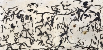
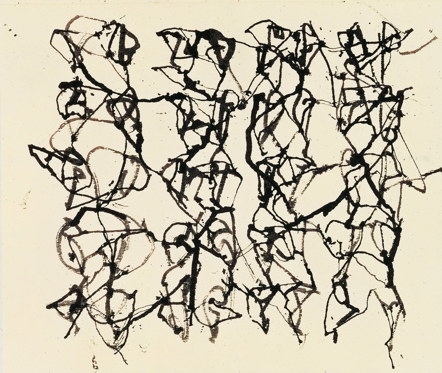
A. It is the pattern on a bird’s egg, the egg of the Common Murre to be exact, and below it is a drawing by Brice Marden (10, from the series Cold Mountain Studies). They look similar, don’t you think?

Brice Marden 10

In her book, A Primer of Visual Literacy, Donis Dondis points out that line communicates essential information (based on our intuitive need for balance as we stand and see the world vertically on a  horizontal axis). When balanced, line direction can create the feeling of simplicity, order, regularity, and symmetry (which is visually pleasing and calming) or it can alternatively create complexity, instability, disorder, stress and irregularity (which is perceived as active and destabilizing). This is the difference in experience we get when we look at a perfect spiral of a sea shell as opposed to looking at the fracture patterns of cracked ice.

Marden’s treatment of line is particularly intersting as it has both characteristics. It is active but it is also regular. The line travels, appears to be on a quest of some sort, searches, and essentially finds itself and re-merges again and again. It is actually more regular than the natural pattern on the bird’s egg. Marden’s line associations are rather intellectual and spiritual for what might be viewed as a simple abstraction. This is an example of the way that line can communicate deep meaning.

Natural patterns and textures are infinitely variable and fascinating and our familiarity with their compositional elements helps inform artistic narrative (whether pattern is intricate or bold, or textures are smooth or rough, we have strong visual and intellectual associations with these elements). Just as pattern creates movement and direction as the eye follows, retraces and attempts to understand the direction of the regular or irregular line, texture allows viewers to optically touch what they intuitively want to better understand.

52

Q. How many kinds of non-verbal language systems are there?

A. Quite a few, such as sign language and hieroglyphics. There are a variety of other compact and coded visual communication systems, including musical notes, maps, blueprints, diagrams, and pictograms, all of which translate things that are best understood visually.

53

Q. What’s the difference between these two patterns?

A. The pattern above is a cellular pattern (think of corn), and the pattern below is a crackle pattern (think of parched earth). For more on natural forms see LI: Dynamic Form in Nature by David Wade.

54

Q. What is the most powerful visual demonstration you have ever seen?

A. Watching Richard Feynman drop an O-ring into a glass of ice water to demonstrate why a multi-million dollar space craft and the lives of seven astronauts were lost after the Challenger disaster might have been it for a lot of people.

55

Q. What’s the difference between a sign and a symbol? 

A. Both signs and symbols are a form of visual messaging with images. A sign, like the road sign below, provides quick visual information, in this case, telling a driver that a curvy road is ahead. A symbol communicates ideas that are more complex and may be abstract, like the laurel branches above which symbolize peace.

You probably run across symbols everyday and understand the complex meanings they carry without having to think through them.

This seems like a good place to take a moment to talk about primary shapes (circle, triangle, square). Both symbols and signs are often easy to understand, in part, because they frequently reference primary shapes. Donis Dondis discusses the vocabulary of primary shapes in, A Primer of Visual Literacy. According to Dondis, basic shapes have significant meaning based on line direction and our need for visual stability (essential to human survival since we must stand vertically on a horizontal plane to interact successfully with the world). Based on line direction, the circle is associated with continuity, warmth, protection, encompassment; the square with stability and balance; and the triangle with instability since it is tipped and off-balance. The wreath above is based on the circle; the road sign is triangular; and the red cross, below, is based on the perfect square. The meaning of these symbols (and sign) is consistent with our intuitive associations with these fundamental shapes.

56

Q. What’s the most unusual packaging you’ve ever seen?

A. As you can see, there are a variety of weird and wonderful packaging strategies that designers use to heighten visual interest.

Above, meat shorts by Weird Clothing, and below, Japanese melonpan bread.

57

lawrence taxonomy

Q. Why do you think scientific instructional materials frequently use drawings over photographs?

A. Possibly because an artist’s rendering of detail can be even more precise and descriptive than a photograph. This is an illustration by Marion E. Ruff taken from the book The Taxonomy of Vascular Plants by George H. M. Lawrence. Miss Ruff’s drawings are some of the most elegantly rendered scientific drawings ever made.

Can you think of others that have deeply impressed you?

Perhaps it was one of these by Ernst Haeckel of single celled organisms.

Ernst Haeckel

58

Q. The photograph above is by Rinko Kawauchi and the photograph below is the work of Robert Polidori. Each represents a very different approach to photography. Can you describe what the difference is?

A. To put it in rudimentary terms, Kawauchi is a “moment” photographer and Polidori is a more deliberate still photographer. Some of the differences result from the kind of camera each uses. Kawauchi uses a small hand held camera and Polidori uses a large heavy camera that sits on a tripod. This is not necessarily an important distinction but it can help you understand the continuum of expressive orientations in a single medium. There is tremendous variation in approach in the photographic arts, and advances in technology continue to expand the creative possibilities.

Note: I could be wrong, but I think Americans favor moment photographers based on the enormous contribution of street photographers to American photography. We tend to ascribe a higher level of creativity to the spontaneous photo than to other kinds of photos when, in fact, each is equally difficult to execute successfully. While a moment photo can make your heart skip a beat, very still and quiet photos can have equal and lasting power.

See below, their two cameras.

rinko kawuchi_camera

robert-polidori-setting-up-a-shot

59

Q. What material has this artist used to create this sculptural installation?

A. This is the work of Tara Donovan; the piece above is made from styrofoam cups and the piece below is made from paper plates. Donovan uses base materials of all kinds including things we would normally consider trash (disposable cups, straws, paper plates, etc.) to make compelling sculptural landscapes.

Why do you think Donovan has selected these materials? Can you think of another artist that uses found or everyday objects in their work? How do you think these objects help to advance the artist’s narrative? Is there a narrative in Donnovan’s work?

60

Q. Based on the picture above, who is Jesus? Based on the picture below, who is Jesus?

There are probably more  interpretations of Jesus in Western art than there are of any other single figure. The painting above, by Marlene Dumas, shows Jesus looking tortured and well-worn, but stoic (he is defined in this painting by his patient and enduring stare). This is a very understated portrait; you may not have even known you were looking at Jesus. In this painting, he looks a bit like any other homeless person you might see wandering the street, which is probably a large part of what Dumas is communicating about his identity and history.

The picture below shows Jesus as a much more robust and jovial character, looking more like Santa Claus than the Messiah (and this Jesus apparently has a very good orthodontist).

All of which goes to show that different artists’ interpretations of the same subject are endlessly fascinating, and you as the viewer may have more power than you think to select the image which best describes your understanding of familiar subjects.