100 Questions Designed to Boost Your Visual/Arts Intelligence Quotient

71

Q. In the series Mystic Lake, the photographer Katy Grannan has carefully placed her subjects in soft green grass. What thoughts and associations does this placement bring to mind? Why do you think Grannan made this choice? Do these photographs make you uncomfortable and if so, why? 

A. It is hard to say for sure because Grannan’s narratives are nuanced, but what comes to mind is that she has placed her subjects in soft “nests” (similar to the nest a cat might make in which to give birth). There are many visual contrasts in these photographs: the grass is tender but the subjects appear weary; the space is intimate but anonymous; these look like hiding places but the subjects are deeply unguarded and allowing themselves to be seen. There are also other details associated with the vulnerability of a nest: awkward poses, partial nudity, and dampness. These are only guesses, since Grannan’s work defies literal interpretations, but the visual clues are consistent with deep personal vulnerability. Grannan’s genius as a photographer is, in part, in her ability to connect with her subjects and to recognize people who are often overlooked and marginalized. Her work is both arresting and disconcerting for this reason. Ultimately, she keeps her viewers engaged in stories that generate as many questions as they do answers. Gannan’s work can be emotionally disquieting since she allows us to stare, unchecked, at people in situations that we would normally look away from.

72

Q. Which of these lines is longer and how is this visual trick used by artists?

A. All of these lines are the same length. They appear to be different lengths based on their relationship to the surrounding arrows. This is known as the Muller-Lyer Illusion.

Artists use line relationships and placement in the visual field in ways that can either agree with or disrupt our understanding of the physical world. Optical illusions, like this, can be used to create realistic perspective as well as to create distortion for psychological effect.

The tabletops below are also the same size.

73

Q. These three artists, Agnes Martin, Richard Tuttle and Don Flavin, are often associated with the same movement in art. What is that movement?

A. Minimalism. Each of these artists has pared down line, color, and shape to their most “minimal,” or basic, elements.

74

Q. What do these objects have in common (think of the Vidal Sassoon haircut as an object if you will)?

A. They are all “sculptural” objects, or art in three dimensions. It isn’t only statues and buildings that are sculptural; clothes, haircuts, and jewelry are small sculptures and they cross over into the realm of fine art when materials are used to define mass and space in new or especially elegant ways. The elements of visual narrative are expressed similarly whether it is in two or three dimensions through the manipulation of line, scale, proportion, texture, and shape and in the case of three-dimensional objects – the inventive use of space.

What do you think each of these artists was communicating through their poetic use of materials, shape and space?

75

Q. The photographer Laura Letinsky is referencing a tradition in still life painting called vanitas. Compare the vanitas painting by Willem Claez Heda below with Letinsky’s photograph above. What elements are the same?

A. The tradition of vanitas painting is based in symbolic reference to the transient, fleeting nature of life and the inevitability of death. Vanitas paintings, like the one by Heda below, often contain fruit, flowers, glass objects, and may also include musical instruments (as symbols of pleasure). There are usually overt references to either time or death, in the form of clocks, skulls and hourglasses.  The combination of these objects is meant to reference both pleasure and pain, life and death. In the painting below, the lemon is unpeeled, the perfect bubble of glass is broken and a goblet has been tipped over. The lemon and seafood also reference things that can be viewed simultaneously as both sweet and acrid. Someone has dined at this table and we are left to view their beautiful remains.

Letinsky’s photograph above has similar references. She is showing us a table, also covered with a cloth, and someone has already eaten here (there is an empty plate and a slice of melon is gone). Although there is no overt reference to death (like a skull or clock) we are looking at fruit that is no longer ripe and at the remains of a meal. The beautiful orange sucker (which provides a perfect color balance to the melon) may be Letinsky’s modern reference to pleasure. There is enough similarity to believe that her compositional choices are based on the vanitas tradition of still life painting.

76

Q. How did this photograph of Emmett Till advance the cause of civil rights?

A. Emmett Till, an African American boy, was 14 years old in 1954 when he was brutally beaten and shot to death by two white men who claimed he flirted with a white woman while visiting relatives in Mississippi. Emmett’s mother showed immense courage at the time by electing to keep Emmett’s casket open to viewers at his funeral so that the badly destroyed face of her teenage boy could be seen by the public. Public shock turned to outrage, and the injustice could no longer be ignored. The pictures of Emmett Till in his casket, which were widely circulated at the time, helped to draw attention to the extremes of southern racism, and remain an important turning point in the history of the civil rights movement.

The contribution of photography to social movements is significant. It is now almost impossible to think of a news story that is not supported with a photograph or video and these can often be more powerful in their influence than the written word.

What was the last news photo you saw that left a lasting impression on you or changed the way you thought about something?

77

Q. As photographers, we have all taken, or have been tempted to take, close-ups of flowers. Why are the photographs of flowers below significantly more accomplished than the photograph above?

A. The flower photograph above is appealing; it is a perfect flower captured at its zenith and one can see why the photographer would have wanted to remember this particular moment. It isn’t a very complex image, however; it is easily understood and we don’t revel in it for too long.

The flower photographs below are by Nobuyoshi Araki and are significantly more complex, both in their compositional and color arrangement and in their narrative. These flowers look rather exhausted and are no longer perfect. Interestingly enough, it turns out that imperfection is significantly more interesting to look at than perfection. The associations are more gripping and interesting and the narrative is more mysterious. Are these arrangements allegorical, telling the lovely but heart wrenching story of life and death?


Just in case you don’t believe that an imperfect flower is more visually interesting than a perfect flower, below you will see two flower photographs by Rinko Kawauchi that also demonstrate this. The first photograph is of a perfect flower, but again, the narrative is more complex because the flower is so fragile and sunlight that it almost appears to be quivering (the story is as much about fragility and temporality as it is about perfection). This is the way a master photographer handles and extends what might otherwise be a common subject. Her second flower photograph is actually about birth, not really about the flower itself. Again, these are significantly more mysterious and memorable narratives. So the next time you are tempted to photograph a flower, allow your photograph to do more than represent a flower…let it tell your flower’s complicated story with a full and clear voice.


78

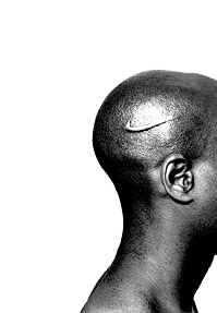
Q. These African-American artists (Hank Willis Thomas and Glenn Ligon) deal with issues of black identity. What do you think is similar about their approach?

A. Both artists are putting modern twists on historical references to black identity. In the case of Hank Willis Thomas, above, he is working with the ancient, tribal tradition of scarification (a rite of passage). In this modern portrait, he uses the Nike logo as the scar. By re-contextualizing this famous symbol, he is commenting on the “branding” of black males and the ubiquitous illusionary attachment of black male identity (and worth) to athletics. This is a deeply intelligent and powerful merger of modern and traditional elements.

The lithograph by Glenn Ligon, below, is similar. It puts a modern spin on the historical use of broadsides to identify runaway slaves. Although it looks like a traditional broadside, the description of the runaway is Ligon himself. Again, this is a brilliant example of the way an artist can extend and rework historical devices and narratives. Identity is evolving here but it is still deeply rooted in and informed by the past.

79

Q. What is the best “how to” drawing you have ever referenced?

A. If you have ever tried to clear a paper jam in a photocopier, put your IKEA furniture together, or attempted to tie a bow tie on prom night, you have probably referenced visual instructional materials drawn by artists, designers and illustrators – and maybe even a few engineers. These can range from the sublimely simple and elegant to the frustratingly awkward and complex (depending on the skill of the artist). If they are overly elaborate, they may confuse, and if they lack appropriate detail, we may miss important steps. Here are two examples of excellent “how to” drawings. Pay attention! You may be getting more visual lessons in a day than you were aware of.

You may also notice that visual instruction can be the best way to transmit information when language and literacy barriers must to be overcome.

80

Q. What is visual clutter and why does it matter?

It is, as the term suggests, excessive information in the visual field which overloads, confuses, and distracts the viewer. The term is often used in reference to the design of maps and diagrams from which viewers must be able to quickly grasp complex information and relationships. Many of our basic daily tasks, including our ability to extract information from web pages, is significantly affected by visual design strategies and techniques. The more elegant and simple they are, the easier it is for viewers to get what they need. Visual clutter is also of interest to scientists, since a cluttered visual field (such as on a roadway) can interfere with a drivers ability to make decisions, and can even impact the effectiveness of the baggage x-ray process (since each suitcase and its contents are visually unique and must be scanned rapidly by airport personnel). The suitcase below contains something illegal. Do you know what it is?

(Pssst…it contains an explosive called Semtex…but if you were a skilled scanner, you would already know this).